Pages

Wednesday, December 8, 2010

Fairy Flyers

Fairy Flyers are miniature paper mobiles that are strung on wires and affixed with a magnet so they can go anywhere a magnet goes. I hang them from my metal work lamps. If you want to hang them from somewhere that does not have a metal surface, (such as a lampshade), you can place another magnet behind the flyer magnet to hold it in place, with the lampshade in between. I bought 100 magnetic clasps years ago. They were not secure for jewelry and being the magnet hoarder I am, could not discard them. They work perfectly for my little fairies as the figures are lightweight.

This little lady is a design from my book, Silhouette Style. She is cut from Yupo paper and colored with alcohol inks. She is glazed with a paper glaze. When dry, details are painted with translucent iridescent paint, glazed again and sprinkled with glitter. When the glaze is completely dry, the fairy is glued together. Her body is actually four pieces. Her wings are two pieces, treated with a crackle glaze.

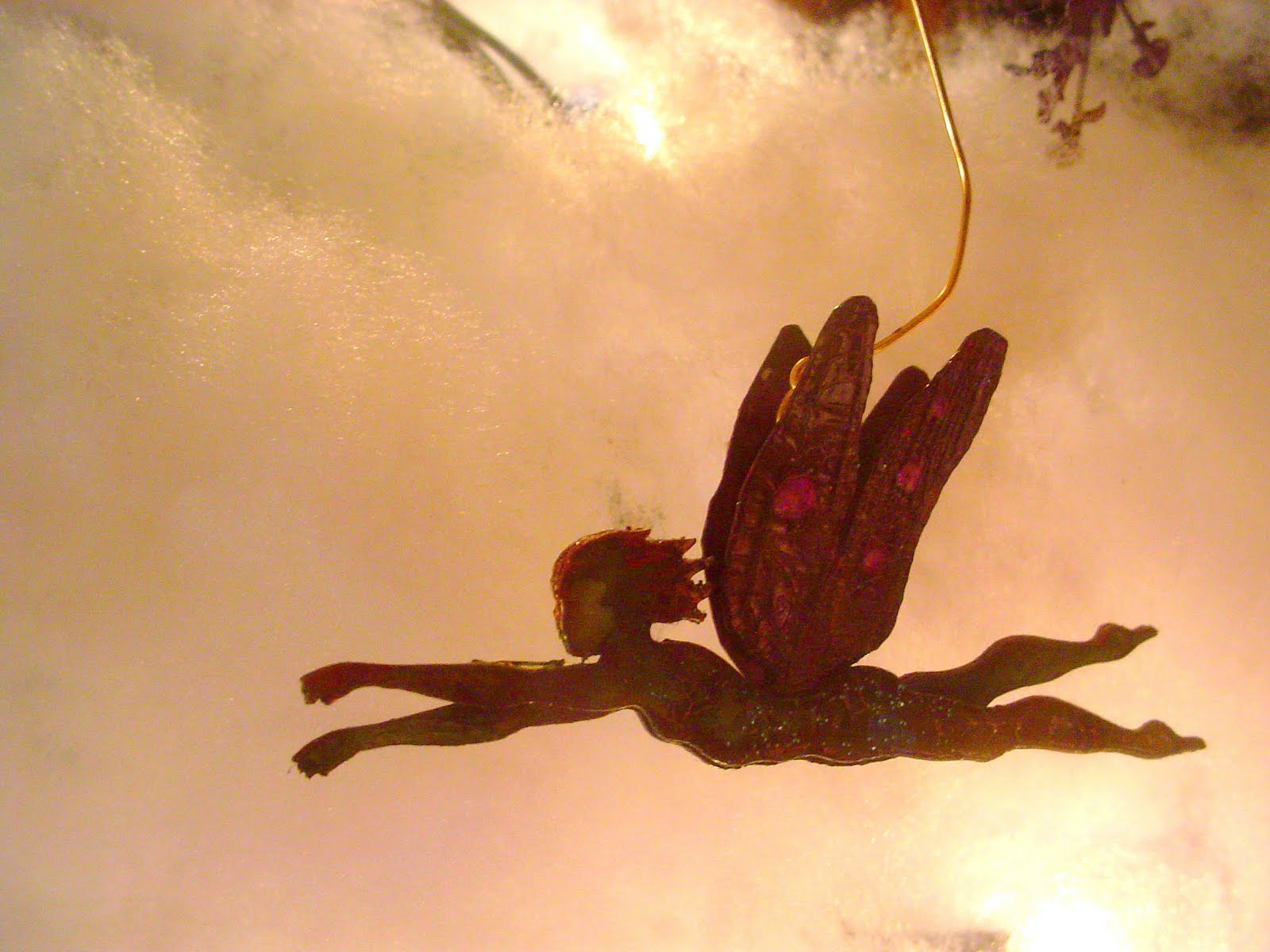
Shot in front of fiber-fill synthetic batting and twinkle lights, this violet fairy flyer seems to be on her way lightly. This one utilized a new hanger design. The hanger is hidden between the wings. For some reason, it threw off the balance of the fairy and she went into a nosedive. She gets a pretty glass flower belt and the problem is solved. Well, for this one. Now back to the drawing board on the hanger....

Violet is also the palette for this tiny girl. She is a little over 2" tall. The figures start out white. I drop alcohol ink on the surface. It dries unevenly, which I encourage by touching it with a brush as it is drying. I spatter alcohol onto the dried ink and it makes little bleached variations that I enhance with the iridescant paint. Her skirt is trimmed with a coarse silk ribbon.

I can't seem to remove this shot, so let's talk about the wire. I found that bending the wire is more interesting and effects the way the fairies turn. I put fishing swivels on some of them to give them a nice spin.

Orange and sunshine yellow combine for vibrant color splashes. She is not glazed. If you look closely, you can see the variegation in the wings. Her dress is embellished with the tiniest pearl sequins I have ever seen, and teeny hologram stickers from Dillons, of all places.


Monday, November 8, 2010

Paper Dolls: Minni Mod


Minni Mod, wardrobe and case.

Introducing Minni Mod. She is an original jointed paper doll, standing 5", though she thinks she is taller. She is actually made of a new plastic paper that makes her durable and lightly washable.

Her wardrobe is made of patterned paper - oh! the patterns. Minni likes earthy tones, reds and especially green. She has a unique style, but doesn't fancy much glitter. You can see a sampling of her wardrobe spilling out of her little red and white polka dot case.


Here's Minni's poster. She poses with her guitar. It goes everywhere with her. She also has a pair of purple pearl fairy wings for the times when she feels a touch of whimsy.


Here she is - ready for the stage. She wears her favorite red hat and polka dot dress. Minni Mod has a magnetic wardrobe. She and her clothes are illustrated, crafted and embellished by hand. Many outfits are detailed with ribbon and other trims.

The fun thing is, you can also design your own fashions with blanks or get more outfits that will fit her.

Minni is able to be gently dressed and posed, but is an art doll and not for small children. Will she come home to you?

Wednesday, October 27, 2010

Shameless Last Minute Promo: Get Painted!


It occurs to me that Halloween is only days away and I could be painting people!
If you want to do a painting party, book it now. I am only doing one or two.

Here is CeCe with a painted necklace. The jewel in the center is adhered to the skin and stayed on a long time. The design is a root necklace. Blood droplets are enhanced with red acrylic stones. She stopped people in their tracks. She frightened at least one. We weren't even trying!

I can paint one or ten, with a 4 hour block. Contact me through Facebook for details. I can do pretty, spooky or pretty spooky. My blacklight paint is awesome.

I use professional paints, both water based and temporary tattoo body paints. I don't do logos or cartoons and will help you interpret your idea, at my discretion. These are one-of-a-kind designs from out of my head.

Consider:
painted on masks - so much more comfortable - with "jewels" or metallic paint
lacy white patterns - glow bright blue under a black light
the undead - glowing ghoul faces and hands, skeletal or decaying
bruised and battered - look beat up good, act scrappy
florals - freaky vines or pretty flowers
old and in the way - caution - you may resemble an older relative - very scary
in stitches - laugh all you want, it won't hurt - farmer's tan encouraged
mod - which once meant modern, but now means retro - think peace sign
jewelry - necklaces, bracelets, anklets
tattoo - a heart, saucy mermaid, fairy, names on scrolls
bald and beautiful - nothing says freaky like a face on the back of a head

Wishing you a safe and happy Halloween!


Monday, October 25, 2010

Introducing: YUPO


YUPO is a polypropylene sheet that looks and acts like paper, but uses no trees and is 100% recyclable. I think it is awesome. It is used in the printing and packaging industry. Artists discovered it as an excellent surface for watercolor techniques.

I have worked with YUPO for about 6 hours total. I have only just begun to experiment. This thin, sturdy, waterproof material is ideal for miniature cutting, because it enables me to cut accurately. It is so smooth. It's like buttah....

The tiny keys above are cut with my Klic-n-Kut electronic cutter and painted with alcohol inks. The alcohol inks by Adirondack are permanent, unless you put them in contact with alcohol or a similar solvent. What is amazing is a build-up of bronze-colored ink on each side of the key makes it look like a real key to scale. I add just a touch of blue or slate so it doesn't look too new. I accidentally sat on a couple, and they snapped back into shape. I am in love. I should note that items I bent that were untreated creased and stayed that way.


Yupo and alcohol inks are used here in a wash. I did use alcohol, sparingly, to remove pigment as well as thin it. See how the lips are built up and lifted of color. The hue is brighter each time it is applied. However, as in all watercolor brush techniques, there is the possibility of saturating and pooling the color beneath. It is a sweet dance of which I allowed the underlying surface to lead. The result is a loose style of color layering.


I am getting requests for miniature items for cards and encouragement to try dollhouse and doll scale items. Scale can be a fun exploration. Notice how the tiniest model distorted. I don't know why. Buckles are fun to use on dolls, cards, packages, and ribbons. The key is a blank. What a difference from the first photo!


Had I corrected this photo, you would see the brilliance of color on the butterfly wings. The color is magenta and violet. The satin-y look is from a pearl version of the ink. The dots are pearl and the veins are done by dragging a brush from one end of the wing to the other. That's it. The ink and the surface do the rest. Again, I am using a loose style and unconcerned about symmetry. Sometimes the ink built up gets sticky. I matted it down with glitter. Of course I did.

Friday, October 22, 2010

Paper: Cyan Haunted House Vignette

Haunted House: Paper, tea lights, feather boa, fake spider web


This haunted house photo has been saturated with blue, resembling a cyanoprint. Checking on a cyan fact, I ran across some spooky information on the color

CYAN:

Cyanoprint - a technique of photography developed about 160 years ago that used a mixture of chemicals including Prussian Blue pigment and no silver.

Prussian Blue was one of the first synthetic pigments and is called: Parisian Blue, Berlin Blue and Cyan. From Prussian Blue was derived Prussic Acid and ferrocyanide, (meaning a blue substance with iron in it).
It is used in photography, blueprints, paint and inks.

On an electronic display device, it is called Electric Cyan. Printing ink is Process Cyan. Add white to it and you are back to Electric Cyan.

Web Color Aqua is another name for Electric Cyan.
Cyan has been called, "Aqua" since 1598, because it looks like tropical water. That is why it is used to paint the bottoms of swimming pools.

Some cyanides are toxic and some are not. In plants, cyanides are found in seeds, like almonds and stones such as peaches and defend the plant against herbivores, though in minute amounts. Cyanides are produced by some algae, bacteria and fungi. The popular blue-green algae owes it's color to these compounds.

The most dangerous is hydrogen cyanide and it's derivative salts.

Lack of oxygen results in cyanosis, because the skin turns blue.


Kyanos is the Greek word for dark blue, from which the word comes.

Is cyan a beautiful color of aquamarine blue, the sweet scent of almonds, or deadly poison? You decide. Mmmmwwwhhhaaahhhhaaahaaaa.


Thursday, October 21, 2010

Beadwork: Citrus Florals

Citrus Floral Necklace, polymer clay, glass beads, nymo thread

Polymer clay leaves, blossoms, pods and coins in sunny citrus colors might seem an odd choice for the fall season. But what day wouldn't be brightened by this smash of candy hues?

Premo is the polymer clay used in this piece. It stays somewhat flexible, which gives it great endurance. And the brightness is obvious. The blossom in this detail shot shows the sparkling effect of the metallic clay tips. Notice how the metallic clay is not blended in - the design is rather chunky. The leaves are bold, but softly variegated using the Skinner Blend technique of shading. Two colors roll through a pasta machine over and over, until an Ombre effect is achieved. The Skinner Blend is named for Judith Skinner, a pioneer of polymer clay art. This technique is the backbone of many a polymer designer.


Again, I am thinking candy. I just want to eat this up. What flavors would it be? Mango, lime, kiwi, lemondrop and just enough cherry to be the prize.

I like the black tiger spots on the blossoms and inside of the pods. These are tiny pieces of clay. The pods are made of a slice of a kaleidoscope cane, cupped in my palm and rolled with a ball stylus. My version of this kind of cane is not very symmetrical, which is fine for this "organic" approach. Aren't the cane edges fun - the yellow and orange stripes?

The coins have a central hole with a slight recess. This is done with a very small ball stylus. A single bead can nestle down into the sew-on. The cane for this one is in a very loose style. The color seems splashed on.


Here are the "greasy" yellow beads, again. The tropical colors brighten them up. The greasy quality is suggestive of a juicy fruit. The mango colored accent beads are actually pearlized, which is not apparent in the photos.
Yummy.

Wednesday, October 20, 2010

Beadwork: Red Floral

Red Floral Beaded Necklace, polymer clay, glass beads, nymo thread

Polymer clay floral blossoms in red and black make for a dark romantic necklace. The combination of red and iris beads are an exotic mix. The red cranberry colored glass beads are a nice compliment to the sparse sprinkling of red coral pieces. The matte iris berry beads reflect the matte finish of the florals.


Iris describes the multi-colored finish of glass beads. This necklace has a mix of blue and purple iris beads as it's foundation. Notice the few spots of blue mixed in.

This is a good example of the fringing that the blossoms are nestled within. Fringes are branched beadwork, each knotted at the base to allow for easy movement, as fringe should have. Branched fringes become shorter and more spaced on the necklace itself, completing the statement.

Tuesday, October 19, 2010

Paper: Haunted Witch Card


Haunted, my newest set of paper silhouettes combine for a spooky scene, shot to be a card front. Two main challenges befell this arrangement: standing up of the props and getting the right focus with the camera. The grasses and picket fencing are excellent for interlocking, allowing for some features, like the pumpkins, to stay put. The grasses and fencing are curved so they will be free-standing. The trees, however, require some stand of their own. These are held in place by luck. And, it may be time to borrow a better camera.

What I love about this scene is the layering and dimension. The central character is a large rocking witch. Her hat has a nice bend and the bat is charming. The background paper makes for different effects with different lighting. It has a pearl layer that reflects the light.

Another version of the witch card. This one is less defined, but much more moody and dramatic. The lighting is achieved by placing color-changing led tea lights around the scene.


I like this one best. It has good contrast of color, light and dark. The colored light shows up, but is subtle. This witch is holding a crystal ball. She is much smaller than the witch above. The corkscrew willow in gray is a nice effect among all the black. I like how the background pattern shows up and then fades out in the upper corner.


Monday, October 18, 2010

Paper Witch Rocker

Gazing into a crystal ball, this witch rocks. Really, she rocks! She's the newest addition to my Haunted collection, which is new too. The rocking witch is a layered paper figure. Her hair, hat, cape, arm and skirt are all separate pieces. She rocks with the tap of a finger.
The crystal ball is a miniature acrylic cabochon. She can also hold a Jack-o-Lantern. This witchy girl would make a great place setting or cut larger, a centerpiece. I love her "Bewitched" collar and sleeves.
This view shows "behind the scenes" construction. The rocker is made of a rounded hem of her skirt in the front, (the jagged edged skirt is layered on top), and an oval glued onto the back. It is hard to see in this photo, but if you look closely you will see a notch taken out of the oval. This is no mistake. It is put there to keep the figure from rocking completely to the side. It is a catch, or a brake.

The quarter is taped inside the front bottom of the skirt to give it a center weight, allowing it to rock. I did three models. It cost me 75 cents. I figured out that washers cost the same or more than quarters. Why not just use quarters? Double stick tape holds them in place.

Saturday, October 16, 2010

Beadwork: Floral Necklace 2

Floral necklace, beads, nymo, polymer clay


Floral Necklace 2

Oddly yellow beads are the foundation for this palette departure. I have had these beads for many years. They look like "greasy yellow" seed beads, as they have a strange translucency. This effect is called, "Vaseline" glass, which is a darn good description. True Vaseline glass, however, fluoresces under black light and these do not. The yellow seed beads are large and irregular. They are woven into a necklace using a technique called free-form peyote.

The accent beads are my favorite - alabaster. They have a subtle, pearl-like inner glow, with a touch of pink and amber. Mmmm. These are the last of the one tube I found at the gem and mineral show. The tiniest beads are silver lined pale yellow.


This light brings out the amber in the alabaster beads. The next photo shows how they respond to blue by reflecting that color.
I am a big fan of color-shifting glass.

The little purple blossoms and petal coins are made of Premo and Studio clays - both by Sculpey. The studio clay has a matte finish and texture. It feels soft and velvety.


The floral "coins" are slices of a cane, with a single hole made for stringing in this way. I use a large eraser to neatly flatten them without leaving fingerprints. The cupped blossoms are flat, then rolled into a hollow shape with a ball stylus.
The triangular style blossom is formed on a cake decorating tip.
Each floral element is then painted with a thin layer of transparent, iridescent paint.

Branch-like fringe gives this collar-length necklace a nice feel and movement.
The contrast of the yellow and the violet make for an unusual palette.


Friday, October 15, 2010

Beadwork: Bella

Bella, miniature collage cabochon, polymer clay, Nymo, glass beads

Bella is a collar-length portrait necklace. I begin with a clear acrylic cabochon, which is transformed into a miniature collage by applying images to the back of the cab. I work backwards, because the first images glued on will be seen as the top layer. This one uses a rose motif as a frame for the portrait, (a tiny reproduction of an antique photo). After the portrait is applied, the background is accented with a couple of pieces of iridescent "snow" flakes and finished with variegated gold leaf. The cabochon magnifies the collage. The layering is noticeable, the depth is a pleasure to gaze.
The collage is adhered to a stiff felt backing. Glass beads and polymer clay pods are embroidered around the cabochon. The back is finished with a final layer of felt, stitched in place.

I use fine beading needles: John James, size 13. I will use other needles, but only in a pinch. They are strong, thin and bend, rather than break. Mine begin straight and end up completely curved. As long as a needle stays sharp, I will use it until it breaks. John James.
A palette for fall-rich purples of the tiny iris beads, deep red of the garnet chips, cranberry, mink, orange and touches of blue-gives abundant versatility for autumn moods.

Bella is is a unique flavor of ornate and simple. The scale of the focal piece is compact, but heavily beaded and embellished. The sparse fringing at the center of the piece reflects the structure of the necklace. The pods and berries on the necklace are minimal, but add volume visually.

Friday, September 24, 2010

Winfield Photo Shoot


Ce Ce, Me, Winfield 2010

Temporary Tattoo Art

Winfield, Kansas hosts a Bluegrass festival in September each year. Although I appreciate the music and am married to a musician, my instrument of choice is a paintbrush.
This tattoo design features a dimensional miniature collage dome and jewels adhered to the skin. The design is a jagged root, piercing the skin, with drops of blood. Ruby red jewels enhance the effect of the blood. Instead of standing out, these jewels look as if they are concave. One person told her the design was "frightening". For an artist who makes miniature shoes and fairies, it is nice to visit the darker side.

The design is painted with a brush, then set with iridescent powder and sparse glitter. The iridescence is mica powder in blue and violet. It allows the detail of the paint to show through, but is metallic at other angles.


Phanie, Ce Ce, Siamese Twin Study

I discussed a concept with Ce Ce and before I knew it Phanie was in and the photo shoot was on. Aside from Ce Ce's tattoo, which was done the day before, we must have spent 6 or more hours working this idea.

By the end of the day - no more natural light - we were ready to shoot. Linda Cunningham stepped up to be our lighting tech. I think the effect is haunting.

Ce Ce styled the costume. I love the shared belt! I completed my concept with the dark and dramatic make up. We talked about the character of the sisters and how they do not shy away from their unique fashion just because they are conjoined.


This shot is completely raw. This shows off the belt, but the shadow on Phanie is too dark and the shared arm is awkward.

Sisters is an enhanced photo. I cut the girls out, then gave the background a chalk filter. I straightened Phanie's candle, which was leaning far to the side. I isolated Ce Ce's tattoo from another photo and used it to frame the photo. I finished the piece with multiple edgings and digital airbrush details. I may go in and give Ce Ce a flame for her candle.


Wednesday, September 8, 2010

Watercolor: Phoenix

Phoenix : watercolor on paper

Originally painted in the early 1980's, this motif must have been imagined as a plate or card design. My wonderful Dr. P.H. Martin concentrated watercolors were my medium of choice for quite awhile. Unfortunately, I lost them along the way. Luckily, my works from those days are still vibrant.

Phoenix was lightly sketched in pencil, then applied in washes to obtain the shading and blending. The saturated areas utilize the watercolor's full strength and as they pool, they create a stained look.


Monday, September 6, 2010

Polymer Clay: Sleeping Mermaid

Mermaid: Polymer clay, mohair, glitter, half shell, oil paint, approximately 5"

Mermaids are one of my favorite subjects of fancy. This little lady must be dreaming of pearls.

She is sculpted of polymer clay - sometimes with a needle, to get fine details. Her scales and fins are made from original canes. The scaling is in a loose style, more graphic than fishy. Her lacy top is made of thin slices of a crackle cane. I chose gold for the crackle.


In this close-up, you can see her delicate little fingers and soft blushing of the flesh. I use water-based oils, lightly applied with a soft cloth. The details are then applied with a tiny (000) brush.

Water-based oil paint is beautiful on polymer clay. It seeps into the surface of the clay, so you get staining that seems to come within. Acrylics are plastic and though some will stain, most will lay on the surface of the baked clay. I use them for eye liners, sometimes lips and eyebrows. I often mix the water-based oil with a touch of acrylic indoor/outdoor paint for the parts I want to have a stronger pigment.

The hair! Her long locks are made of mohair. This mohair is produced for dolls. It is very soft and obviously dyed. It comes in a hank. A hank is a bundle of strands put up in a consistent length and weight.

I pull a strand, wet it and twist it in my fingers until there is a point at either end of the strand. This dries quickly and holds. I apply glue to the top of the mermaid's head, let it get tacky. I then lay the strand in the glue so there is even length on both sides of the head. This is the start of my wig. I end up twirling the ends of loose strands and then shape them to the sculpture to look care-free.

The final touch is displaying my mermaid with acrylic "ice". You can find it in the floral department. It is pretty to photograph. It is not fun to step on.

Sunday, September 5, 2010

Digital Collage: Who Shall Lead?

Who Shall Lead? Digital Collage


Angels of stone gather around her. Who shall lead? illustrates a diversity of angelic iconography in several styles. She, who is floating above stepped passageways, is surrounded by angels who seem more curious than helpful. The roses suggest a recent passage of a woman who appears to surrender to uncertainty. Her arms are relaxed and vulnerable, her feet do not touch the ground. She is floating just above and her dress is made of burning candles.

Digital Collage: Lonely

Lonely, digital collage

Lonely speaks of the odd, the off, the different. What is this man's story? Is he angry, resolute? Does he play music or only wish so? The eye in the box gives the sense of him never feeling quite free of judgement. The discarded doll; a discarded childhood? The man is eccentric and alone, standing at the edge of the composition. Soft shadowing keeps him feeling outside of things. Broken and degraded is the environment. Lonely is the mystery of the outcast, the forgotten. From where has he come, where has he to go?

Saturday, September 4, 2010

Beadwork: Oil Slick Medicine Bag

Beaded Medicine Bag: glass seed beads, thread

The "oil slick" effect of this beaded medicine bag is achieved bead by bead. The color of these lovely glass seed beads are called matte iris. They come as a rainbow mix.

I choose a starting color, then use my needle to pick up the next closest color. I find it very relaxing. I focus my color vision and somewhat unfocus my natural vision so the color I desire pops out of the mix. It would be tedious if I didn't enjoy the challenge.

The bag itself is woven in a peyote weave, also called the gourd stitch because of how easily the weave conforms to an object. I begin with a circle of beads on my thread. Then I add two beads, skip two-so on and so forth. The next row fills in the two skipped beads. This simple process builds the bag. The resulting circular tube is stitched together at the bottom to complete the bag.

Fringe is stitched to the bottom of the bag. Each strand is knotted. Not only does this secure the fringe, it helps it to have flexibility.

The light-catching accent beads are vintage cut bronze Czech beads and are very old. The irregular cuts are a nice contrast to the matte seed beads.

What to put in a medicine bag? A coin, a crystal, a note, a lock of hair. Special tokens seem to find their way to a little pocket worn close to the heart.


Wednesday, August 25, 2010

shows: Melange Moves

This is an exciting show for several reasons.

Melange opens it's doors for Final Friday for the first time in the new location, 718 West Douglas. It is just down the block to the West, on the North Side of the street.

They have done a lot of work to make the space fit Leslie and her many talents. The room showcases her fine jewelry and jewels in a bright atmosphere. Her commitment to teaching is evident in the student area and viewable lampwork glass bench.

The featured artist is Mike Fallier. I have been a fan of his work for many years. I can't wait to see his paintings.

I have two new cases that I am going to fill with lots of paper items, in celebration of my book soon to be released. You can peek at the book and pre-order it. I will have beaded jewelry and a fresh stock of cards.

Mark Horton, my husband, will be entertaining us with his original music.

Doozie Dyes will be on the sidewalk. Dulcie Guinty will have lots of tie-dye just in time for Winfield.

Come join us for wine and sushi, art and music from 7-10 Final Friday in celebration of

Melange's new location: 718 West Douglas

So exciting!


Friday, August 20, 2010

Miniature Shoes: Felt Prototype


This is a view from my laptop. It shows different parts of the shoe. I can send these drawings to my KNK Maxx electronic cutter and they will be cut exactly as seen on screen. I can change the size of my cut to make smaller or larger shoes.


This view shows the KNK, (Klic-n-Kut), MAXX. The Maxx is a professional, heavy-duty electronic cutting machine. It looks good, but performs even better.
On a carrier sheet, you can see a piece of stiffened felt which has had it's shoe pieces, (and a bunny!) taken from the felt.


The felt shoe pieces on my worktable. I am getting ready to sew the pieces together with thread and a needle. I prefer to use sharps. They are small and sharp! Here I am using sewing thread.


The finished shoe fits Mag, my Asian Ball-Joint Doll. She is 1/3 scale. You can see that the shoes are stitched together on the outside of the shoe in a blanket stitch, meant to be seen. Note that the shoes are elongated and pointed into an elfish style.

Although I am pleased with the outcome, the sides of the shoes could be higher on the foot for a better and more stable fit. I will go in and adjust the design file accordingly.


Tuesday, August 17, 2010

Work in Progress: The Common Things

The Common Things, paper, ink


This is a scan of one of my book pages for The Common Things. The original is a combination of machine and hand cutting. The landscape pieces are swiped with an ink pad for shadowing.