Pages

Showing posts with label adirondack alcohol inks. Show all posts

Thursday, August 11, 2011

Flower Clips

Flower blanks, fresh from cutting with my KNK Digital cutting system, these floral pieces are designed on my computer screen, then sent to the cutter for precision cutting. Notice the different sizes of the same design. This creates a larger variety of the pieces. I can mix up motifs. I cut many, many pieces before I begin the coloring process. There is something satisfying about a whole stack of blanks.
Color brings the petals and leaves to life. This shot shows some experimentation with metallics, particularly the large fern. The colorant is alcohol ink, applied with a dropper, then finished with a brush to make sure the edges are covered. In the far right is a floral element with a little more detail. These dashed lines are cut into the surface in a "pounce" line. Ink settles in, adding detail. Unlike my cherry blossoms, these florals are fantastical. Once my stack is finished, they assemble by what is in front of me in a kind of ordered chaos. I love the little buds you see poking out here and there. Each flower is finished with a clip. Originally designed for hair ornaments, they are being clipped onto clothing, headbands and hats.

Monday, July 25, 2011

Blue Fairy and Friends

A fairy blowing a kiss is my newest fanciful being. She is painted with alcohol inks applied with a dropper and finished with a brush. The sheen is Jo Sonya's iridescent blue, following the lines of the ink patterns.


You can see the difference in this photo. When the ink is overpainted with the iridescence it creates multiple light effects. In bright light, it is light colored. In less light, the brilliance of the blue comes through. These ladies would be great where they would catch the light, but as any art piece, direct sunlight is never a good idea if you want to preserve the original color.
A green fairy is painted with ink only. I will be going over the surface with iridescence, not necessarily the same color.
This fairy allows for beads or flowers to be hung from her hand and from the tiny hole in her wing fronds, evident in the middle photo. The fairies will be made singular and as mobile elements.

Thursday, July 21, 2011

Cherry Blossoms

Ah, to dream days of cherry blossoms. As a heat wave sears the country, set your thoughts on light breezes and delicate flowers.
Above, you can see the shimmer of pearl ink, tinted with pink. Red Iridescent Jo Sonya's velvet matte paint adds detail and additional sheen.
The cherry blossom is a double flower, assembled without glue. It takes a bit of patience to push the centers through all the holes and requires tweezers or a needle tool. The end result is worth it.
These are the pieces that make the blossom. This flower has holes for use in a mobile. The blanks here look mod in white against all the color of the background. The spidery center goes on top of the flower. The double center gets curled up and threaded through all the holes - up to four. Two centers hold everything in place.

This view shows a blank assembled prototype. It is made of synthetic paper called Yupo. I am offering the finished design in blanks and digital files in my Etsy store. You can color them with alcohol inks, watercolor, markers and Sharpies. Blanks come with or without holes in sets of three.


Tuesday, July 19, 2011

Did Someone Say Pink?

My first installation at Tanya's Soup Kitchen included mobiles and floral hair clips. One of the first comments was, "Save me a pink one". I was not about to announce that there were the brightest reds, the juiciest oranges and the sweetest greens, but alas - no pink.
Just in time, I received new ink colors. The first to be opened were these vibrant shades. I designed a new flower, which utilizes dashed lines to establish detail. The ink settles along these lines. It is especially evident in the center, where the ink has pooled and dried darker.
The photo above illustrates the edge treatment. I saturate a brush with ink and run it over all the edges so the white is covered. Details always make a difference.
The ink in this photo has just been applied. Ranger's alcohol inks and Yupo were made for each other. Yupo is synthetic paper. The inks come in a dropper bottle. It is amazing how far .5 fl. oz. will go! I drop ink onto the cut flower and allow it to set for a variegated, watercolor effect. Other colors will be added to fill in the white. The predominate colors are: Wild Plum and Raspberry.
A unique feature of this combination of media is that once the ink is dry, it is permanent, but if I add more color, alcohol or the blending solution, I can continue to manipulate the surface. The blue shimmer in the background is red/blue mica powder added to a previous flower. I use Yupo beneath my projects, because I don't want to waste a drop of these beautiful inks. I use the sheets for paintings, bookmarks and cards.
Oh, and the pink flowers will be showing up soon at Tanya's Soup Kitchen. In the meantime, there is a burst of twirling colors already there.

Wednesday, June 22, 2011

Show Photos: ROOTS

Roots: Photos by Lincoln Scott
She Dreams in Blue

Roots was a show of mixed-media sculptures at the Unitarian Church Gallery in Wichita, Kansas. They were gracious hosts and the show was quite successful. Thank you.
She Dreams in Blue is my favorite. I like the blue staining and her stance. The wood base is antiqued with stains. The turquoise color is a permanent ink pad, swiftly swiped over the surface.
This collection features polymer clay root people. The faces are sculpted first, then the arms and legs. All of the roots were formed in batches. The clay was conditioned, (kneaded), and rolled into snakes of various widths. I rolled the clay further until it wiggled into corkskrews, pinched the end and made a hole for stitching into place.
I rummaged through my rust, fabric and lace collections to find just the right pieces. Bead embroidery is the glue of the designs.

Root King Dreams, a relief sculpt, led me to a new discovery. The aged coloring is deceptively simple. I sculpted in white, stained with caramel alcohol ink dropped from the bottle onto the face surface, then rubbed it off. The heavier the ink, the darker it stained. It is finished with a wash of blue/black acrylic paint, which is also removed with a soft cloth.
The fiber is wool, rayon and chenille. Brass leaf stampings repeat for a forest floor rhythm. Tiny cup forms are made of pearl polymer clay.

Wednesday, December 8, 2010

Fairy Flyers

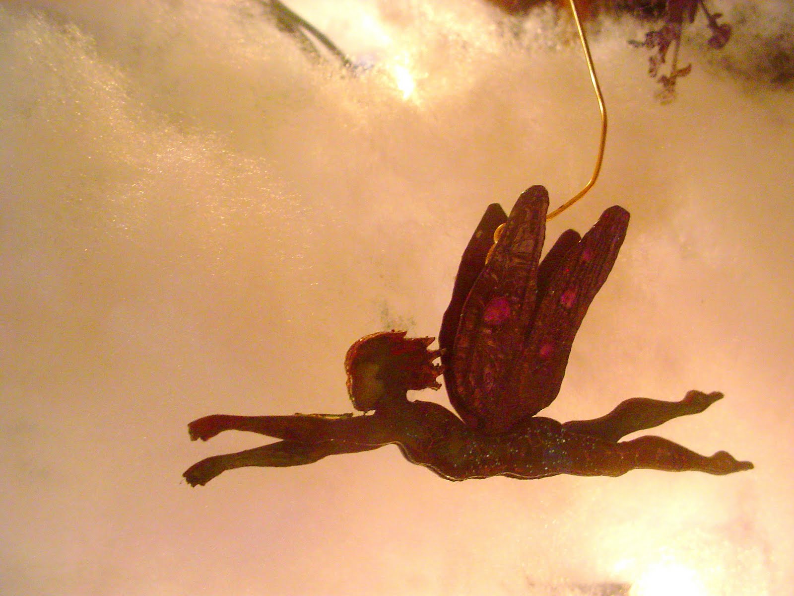
Fairy Flyers are miniature paper mobiles that are strung on wires and affixed with a magnet so they can go anywhere a magnet goes. I hang them from my metal work lamps. If you want to hang them from somewhere that does not have a metal surface, (such as a lampshade), you can place another magnet behind the flyer magnet to hold it in place, with the lampshade in between. I bought 100 magnetic clasps years ago. They were not secure for jewelry and being the magnet hoarder I am, could not discard them. They work perfectly for my little fairies as the figures are lightweight.

This little lady is a design from my book, Silhouette Style. She is cut from Yupo paper and colored with alcohol inks. She is glazed with a paper glaze. When dry, details are painted with translucent iridescent paint, glazed again and sprinkled with glitter. When the glaze is completely dry, the fairy is glued together. Her body is actually four pieces. Her wings are two pieces, treated with a crackle glaze.

Shot in front of fiber-fill synthetic batting and twinkle lights, this violet fairy flyer seems to be on her way lightly. This one utilized a new hanger design. The hanger is hidden between the wings. For some reason, it threw off the balance of the fairy and she went into a nosedive. She gets a pretty glass flower belt and the problem is solved. Well, for this one. Now back to the drawing board on the hanger....

Violet is also the palette for this tiny girl. She is a little over 2" tall. The figures start out white. I drop alcohol ink on the surface. It dries unevenly, which I encourage by touching it with a brush as it is drying. I spatter alcohol onto the dried ink and it makes little bleached variations that I enhance with the iridescant paint. Her skirt is trimmed with a coarse silk ribbon.

I can't seem to remove this shot, so let's talk about the wire. I found that bending the wire is more interesting and effects the way the fairies turn. I put fishing swivels on some of them to give them a nice spin.

Orange and sunshine yellow combine for vibrant color splashes. She is not glazed. If you look closely, you can see the variegation in the wings. Her dress is embellished with the tiniest pearl sequins I have ever seen, and teeny hologram stickers from Dillons, of all places.


Monday, October 25, 2010

Introducing: YUPO


YUPO is a polypropylene sheet that looks and acts like paper, but uses no trees and is 100% recyclable. I think it is awesome. It is used in the printing and packaging industry. Artists discovered it as an excellent surface for watercolor techniques.

I have worked with YUPO for about 6 hours total. I have only just begun to experiment. This thin, sturdy, waterproof material is ideal for miniature cutting, because it enables me to cut accurately. It is so smooth. It's like buttah....

The tiny keys above are cut with my Klic-n-Kut electronic cutter and painted with alcohol inks. The alcohol inks by Adirondack are permanent, unless you put them in contact with alcohol or a similar solvent. What is amazing is a build-up of bronze-colored ink on each side of the key makes it look like a real key to scale. I add just a touch of blue or slate so it doesn't look too new. I accidentally sat on a couple, and they snapped back into shape. I am in love. I should note that items I bent that were untreated creased and stayed that way.


Yupo and alcohol inks are used here in a wash. I did use alcohol, sparingly, to remove pigment as well as thin it. See how the lips are built up and lifted of color. The hue is brighter each time it is applied. However, as in all watercolor brush techniques, there is the possibility of saturating and pooling the color beneath. It is a sweet dance of which I allowed the underlying surface to lead. The result is a loose style of color layering.


I am getting requests for miniature items for cards and encouragement to try dollhouse and doll scale items. Scale can be a fun exploration. Notice how the tiniest model distorted. I don't know why. Buckles are fun to use on dolls, cards, packages, and ribbons. The key is a blank. What a difference from the first photo!


Had I corrected this photo, you would see the brilliance of color on the butterfly wings. The color is magenta and violet. The satin-y look is from a pearl version of the ink. The dots are pearl and the veins are done by dragging a brush from one end of the wing to the other. That's it. The ink and the surface do the rest. Again, I am using a loose style and unconcerned about symmetry. Sometimes the ink built up gets sticky. I matted it down with glitter. Of course I did.